Client: Google UX Design Professional Certificate
Goal: Show users the places they can go using public transit routes near them.
Role: Research, Interaction Design, Visual Design
Design System: Material Design


Client: Google UX Design Professional Certificate
Goal: Show users the places they can go using public transit routes near them.
Role: Research, Interaction Design, Visual Design
Design System: Material Design


I began my project by interviewing users to understand their experience finding information about public transportation.
The interview results were clear:
Most interviewees found planning a public transit trip to be complicated and difficult.
Their stated reasons why:
Transit apps are poorly organized, making information hard to find.
"You have to go into a subfolder of a subfolder to find information on anything... I can't even Google the fare, I have to scour."
It is hard to connect information about multiple routes.
"Finding the source nearest to me, and then connecting it to the next source - if you're making a bus, it goes to what? And then pick up another bus?"

My next step was to analyze existing public transit apps, to see what features I could add to mine to make it stand out.

As the official public transit app of my area, NJ Transit's app is the first place many locals go for facts about nearby transit.

Owned by Intel, Moovit is a popular app that combines official and crowdsourced data to help people plan public transit trips.

While not exclusively a transit app, Google Maps is one of the most popular trip planning apps, and it has features for public transit users.
NJ Transit's app was very simplistic compared to Moovit and Google Maps, so I focused most of my analysis on the latter two.
Moovit and Google Maps' use cases fall into four main categories:
While testing these use cases, some observations jumped out at me.
Moovit can list all transit stops near a location.
Google Maps can list all locations near a transit stop.
But neither app handles both use cases at once.
While it is theoretically possible to find stops near a location using Google Maps, one can only do so by looking for transit stops one-at-a-time on the map. Moovit's method of showing stops in a list conveys the information more quickly.
Conclusion:
An app that lists both nearby transit routes and locations near those routes will stand out among competition.

Left: Moovit listing transit stops near Grounds for Sculpture, Hamilton NJ
Right: Google Maps listing restaurants near Hamilton Station, NJ
Moovit shows all stops near a given location. But the same routes often visit multiple nearby stops, making a list of all stops potentially redundant.
Moovit can list all routes in a given "Metro Area" - but there are few metro areas to choose from, and many routes shown may not have stops near the user.
Conclusion:
Listing all routes near a given location (along with each route's nearest stop) would get across the same information as Moovit, but quicker.

Left: Moovit listing nearby stops in Trenton, NJ. Notice how the same route numbers appear over and over.
Right: Moovit listing all transit routes in the Philadeliphia Metro Area, the one closest to Trenton, NJ. Since Trenton is not a selectable metro area, a Trenton resident would need to use this list - SEPTA lines and all - to find transit routes near them.
When getting directions, Moovit and Google Maps provide transit routes to places that are very far from public transit.
Moovit will put overly long walks in these routes, while Google will insert Lyft rides into them.
Unless a user already knows which places are close to transit, they cannot predict which places will have these unfeasible routes. And with how hard it is for users to find transit information, it is likely that users will not already know this.
Conclusion:
To teach users which locations are closest to public transit, the features showing which routes and locations are nearby should be prioritized over the "get directions" feature.

Moovit (left) and Google Maps (right) showing "transit routes" to places very far from public transportation. Note the very long walk time in the Moovit screen, and the need for a Lyft ride in the Google one.
To best meet user needs, and compete with other apps, I added three features to YourTransit:
To see how these features should be organized, I made a sitemap.

When wireframing, I included every use case from the sitemap. I also kept in mind the conclusions I drew from the competitive audit.
Since YourTransit has three main use cases, I displayed them all prominently on the homepage.
"What's Near Here?" is at the top, since I concluded that the "near here" feature should be prioritized (see Observation 3 above)


I made sure users could see both nearby transit routes and locations near those routes. This would help Valerie understand what public transit is like in her area.
It also follows from Observation 1 of the competitive audit: showing both nearby routes and nearby locations would help this app stand out.
I showed nearby transit routes rather than nearby stops, to avoid the redundancy I noticed in the competitive audit (see Observation 2).
Each route includes directions to the nearest stop for that route, that way people know where to go to wait for their desired route.


For each destination, I showed the shortest possible transit trip first, but still let users see other possible trips.
I also included a link to schedules underneath each transit route. This would help Dante understand complex trips that connect multiple forms of transit.
If a user has entered a location, then showing a transit route's schedule also shows the nearest stop to their location.
Clicking this stop pulls up its timetable, showing the next arrivals and departures.

I made my wireframes into a low-fidelity prototype with four test cases.
Each test case was meant to test a particular feature of YourTransit:
When completing a task, younger users always used the feature I expected them to.
But older users often used different features from the ones I expected them to.
This caused older users to miss key information.
Expectation: All test subjects would use "What's Near Here?" to do this.
Reality: Older test subjects used "View Transit Schedules" to do this.
The Problem:
Unless a user already entered their location, the "schedules" page did not show which routes were nearest - and gave users no way to find out. Instead, it only let users search for specific routes.
Solution:
Make sure the "Enter Location" bar is always at the top of the page, including in the "View Schedules" feature.

Expectation: All test subjects would use "Plan a Trip" to do this.
Reality: Older test subjects used "What's Near Here?" to do this.
The Problem:
"What's Near Here?" did not have a search bar, so users looking for a specific location had to scroll a lot to find it.
Solution:
Add a search bar to the top of the "What's Near Here?" feature, so users looking for a specific place can still find it.
Also, reword the button labels - "Directions" is a more specific label than "Plan a Trip"


The high-fidelity mockups and prototypes were made using Google's Material Design system.
Primary
#42d8f3
On Primary
#00363f
Primary Container
#004e5a
On Primary Container
#a5eeff
Secondary
#3ae365
On Secondary
#003911
Secondary Container
#00531c
On Secondary Container
#6bff84
Tertiary
#ffba49
On Tertiary
#442b00
Tertiary Container
#624000
On Tertiary Container
#ffddb1
Error
#ffb4ab
On Error
#690005
Error Container
#93000a
On Error Container
#ffdad6
Background/Surface
#191c1d
On Background/Surface
#e1e3e4
Outline
#899295
Surface Variant
#3f484b
On Surface Variant
#bfc8cb
Archivo
LIST HEADING
Extrabold Italic, all caps
Size: 36 px
Line Height: 44 px
Location Heading
Extrabold
Size: 36 px
Line Height: 44 px
List Section Heading
Bold
Size: 28 px
Line Height: 36 px
Nearest Stop
Semibold
Size: 22 px
Line Height: 28 px
Body Text and List Item Headline
Regular
Size: 16 px
Line Height: 24 px
Button Text
Regular
Size: 14 px
Line Height: 20 px
Letter Spacing: 0.1 px
Button
Button Text
Chip
Chip Text
Text Field
Label text
Input Text
Search Bar
Search bar text
List Items
Transit stop name
Arrival Time
Menu option

List item
Supporting Text
Supporting text


List item
Supporting Text
Supporting text
Map

On maps, different elements have different colors:
When on a particular transit route's page, the nearest stop is colored Tertiary and has a label. All other stops are colored white and unlabeled.
Stop Icon
Location Icon

YourTransit's largest headings are italic, to convey the forward motion of getting to your destination. To compliment this design choice, the "Near Here" images look like they are emerging from a parallelogram slanted at the same angle as the text.


For visual consistency, I had the "emerging" object in each image extend as far as the top right corner of the parallelogram, and no further. This invisible border kept each image relatively square, and ensured that they all lined up vertically.
Images were colored using the "tonal palettes" for the app's main colors, as dictated by Material Design standards. This made sure images matched the app's color scheme, while still allowing for variety in color.

I used this visual identity to construct a high-fidelity mockup of YourTransit.

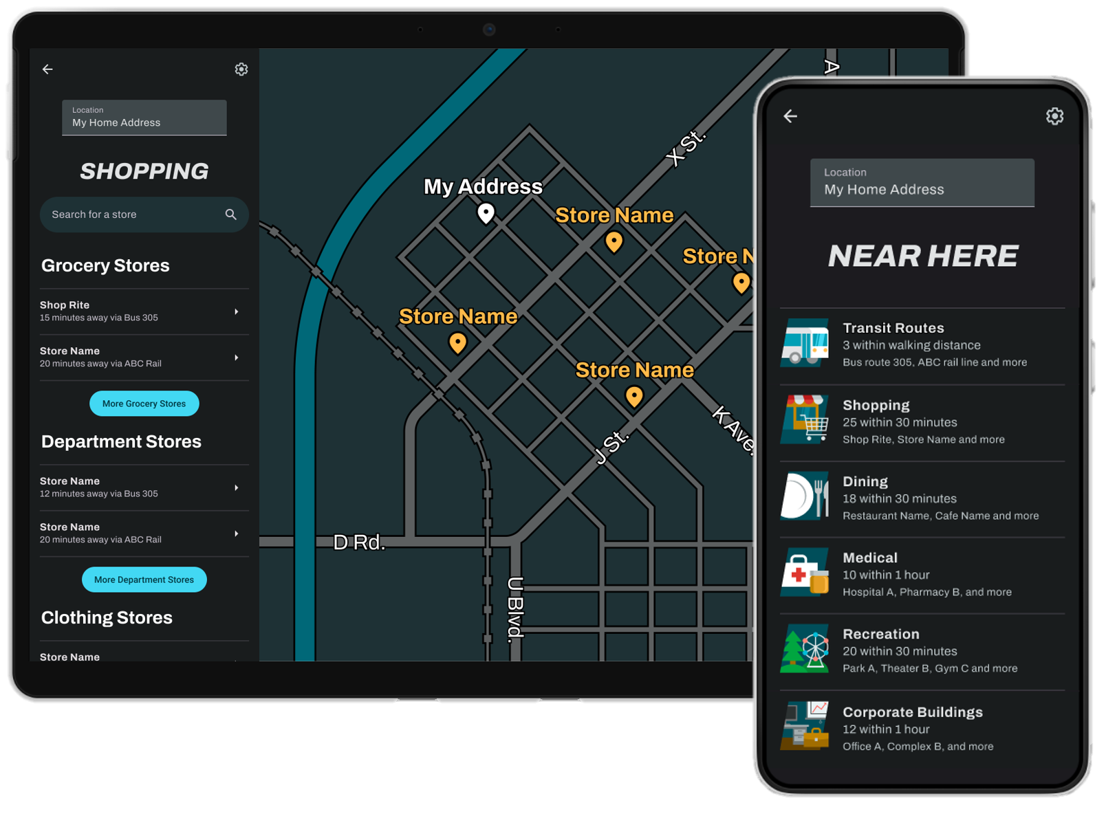
For the tablet version of YourTransit, I put the mobile UI on the left side of the screen, with a large map always visible on the right.
When showing many transit routes together, I colored the two nearest routes Primary and Secondary, and selected two custom colors for further routes:

My prototypes have the following test cases:
This project reminded me to never assume I know how users will behave. Users will not always complete a task the way you expect, so make sure there are multiple ways to complete the same task. Seeing users behave in unexpected ways was edifying and intriguing, and I will definitely look out for user behavior that surprises me whenever I test a design.
This project also helped me practice competitive audits - I learned a lot about what YourTransit could do by analyzing competing apps. I also practiced using a design system for this project, which really broadened my understanding of visual design.