Client: Google UX Design Professional Certificate
Goal: Users are frustrated with online menus. Design one that resolves their pain points.
Role: Research, interaction design, visual design


Client: Google UX Design Professional Certificate
Goal: Users are frustrated with online menus. Design one that resolves their pain points.
Role: Research, interaction design, visual design

Before designing my menu, I needed to know in advance which aspects of online menus frustrated users most often. To that end, I interviewed subjects of various age groups, who had varying amounts of experience with technology.
From these interviews, I found several common pain points associated with ordering food online:
The order that menu items are listed in is often unpredictable.
"I don't want to have to look in five different places to find two sides."
Inability to skip sections that the user does not want to read.
"On paper, you can just flip to the particular page, but online you have to scroll all the way down."
Inability to filter out undesired diet options.
"I don't want to see vegan food if I'm not vegan."
Based on the personas and pain points, I added several features to my menu:
A filter-by-diet feature that hides foods outside of a user's diet.
This would help Devon and his friends order quickly by letting them skip foods they know they don't eat.
An automated substitution feature that lets users hold or substitute ingredients by clicking them.
This would help Martha satisfy her kids' requests without needing to call someone on the phone.

Before settling on one specific design, I sketched as many possible layouts as I could think of, inspired by both competing apps and the needs of my users.

The layouts I decided were best had the section headings on long buttons stacked on top of each other. These layouts addressed users' pain points:
The order that menu items are listed in is often unpredictable.
Display all menu section headings right on top of each other. This lets users instantly see every place they could go, making it easier to predict where desired food items will be.


Inability to skip sections that the user does not want to read.
Make each section header a button that goes to a new page or opens a dropdown menu. This reduces the amount of space each section takes up, so users never need to scroll all the way through sections they don't want to read.
I also made sure that the filter-by-diet button was right at the top, so that people with diet restrictions - like Devon's friends - can order food quickly. This feature also helps people who dislike certain dietary options to avoid ordering foods they don't want.
Inability to filter out undesired diet options.
A "Filter by Diet" button, which allows people to show/hide foods that do not match their diet.

For the substitution feature, I made it so users could click on any ingredient to hold or substitute it. This would be useful for Martha, who could easily click on any ingredient that her kids want changed.

To test usability, I turned my design into a low-fidelity prototype with these test cases:
I then wrote a research study plan with questions, Key Performance Indicators (KPI's) and a script.
I used the research plan to conduct an unmoderated usability study.
Through the study, I identified several patterns in how users responded to the wireframe:
80% of participants had to tap a menu item multiple times before getting its page to open.
This means that it is difficult to tell where to click on a menu item.
"The touch response wasn't precise, so I couldn't tell where to click"
40% of participants either skipped or took several screens to find the filter-by-diet button.
This means that the filter-by-diet option is not always noticeable.
"Maybe if I was looking at a full menu, and there was meat everywhere, I would have thought to look for it. But on this prototype the veggie omelette was right there, so I didn't need it"
40% of participants did not notice the substitution function.
This means that the substition instructions are not always noticeable.
"I didn't read the instruction because it had an asterisk, so I assumed it wasn't necessary... I want to order quickly, so if I don't think I need to read something, I just skip it."
From these patterns I distilled the following insights:
Here is how I addressed each of these insights in my design:
To resolve this issue, I changed the background color and added boxes around each menu item. Now, users can click anywhere within the box, not just on the menu item's name.


To make the button more prominent, I moved it down into the body of the site. I also made the font bolder and made the letters all uppercase.
Instead of an easy-to-skip instruction, I made the substitution feature a button that shows the ingredient list with options to hold or substitute.
This choice was also inspired by a comment from a study participant, who wanted to see all possible substitutions listed in one place, instead of having to click each individual ingredient.


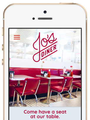
With the wireframes done, it was time to create the logo, color palette and brand identity for the app.

HEX: E2EAF1
RGB: 226, 234, 241
HSB: 208, 6, 95
HEX: B20136
RGB: 178, 1, 54
HSB: 342, 99, 70
BUTTON
BUTTON
BUTTON
BUTTON
Button
Button
Button
I used this visual identity to construct a high-fidelity mockup of the site.

My high-fidelity prototype has these use cases:
The biggest takeaway from this project was to pay very close attention to which aspects of a design are visually emphasized. People only use the features they notice, so it is very important to guide people's eyes towards the features that will most help them.
Were I to continue this project, the next steps would be: